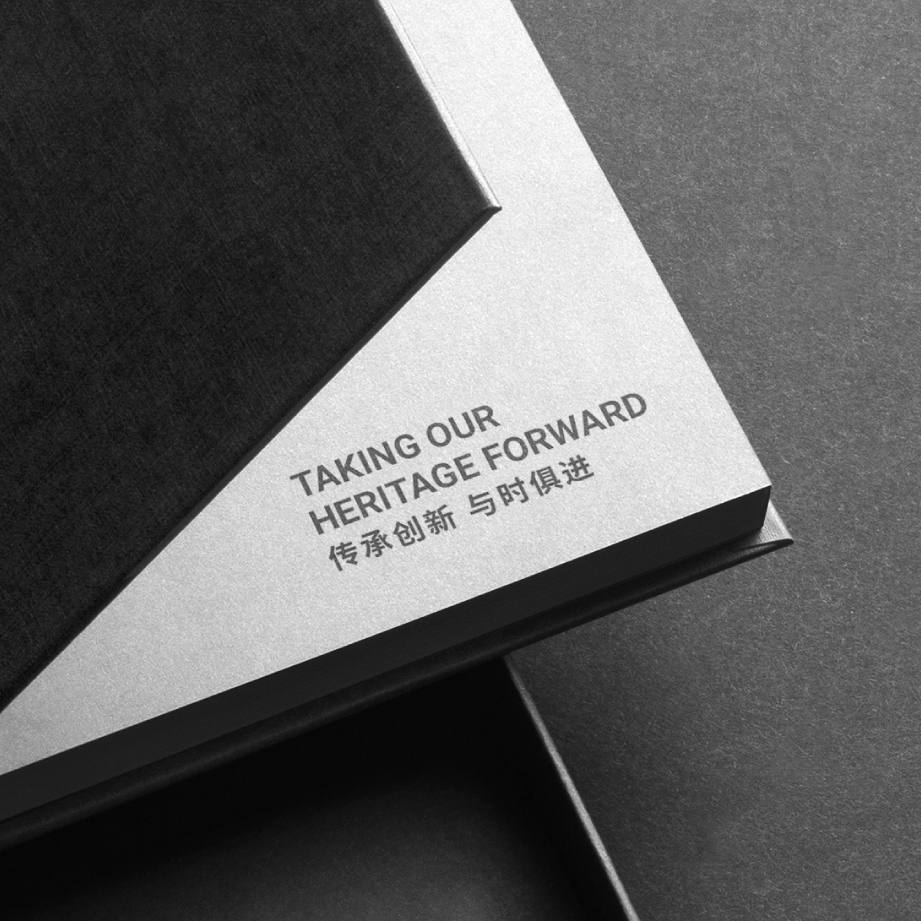
Taking their heritage forward
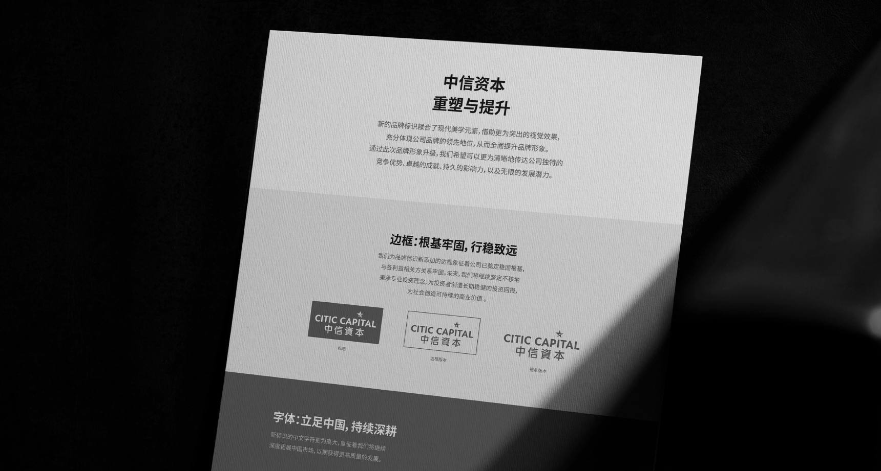
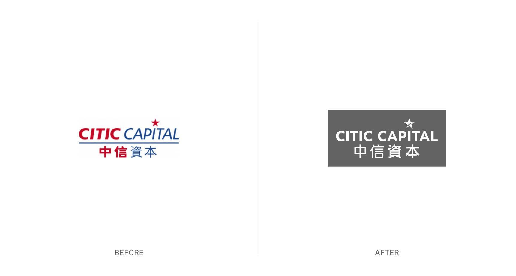
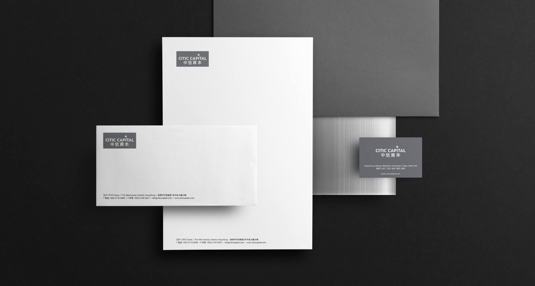
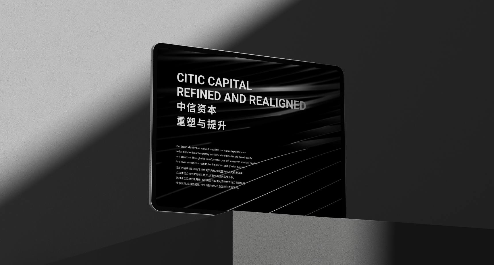
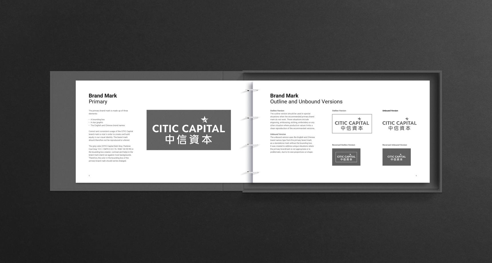
The brand identity takes its iconic star element forward with a larger refreshed star depicted in an agile dynamic way – acknowledging not only CITIC Capital's heritage, but also their energy and drive for the future.


"We really appreciate their dedication to quality."
"BaseCreate undertook the brand repositioning and refreshment for CITIC Capital and one of its major subsidiaries – two very important projects for our group that focus on building a stronger global image.
BaseCreate led our team through a range of strategic recommendations and designs that we refined together through a highly collaborative approach.
The new design helps clarify the brand difference and leadership position of CITIC Capital and its subsidiary. We really appreciate their dedication to quality on these projects and meeting our needs."
Cindy K. K Tam
Director
CITIC Capital
Colours that show contrast
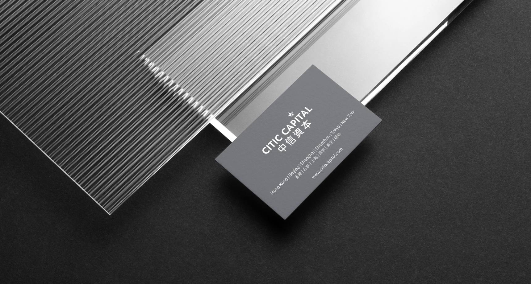
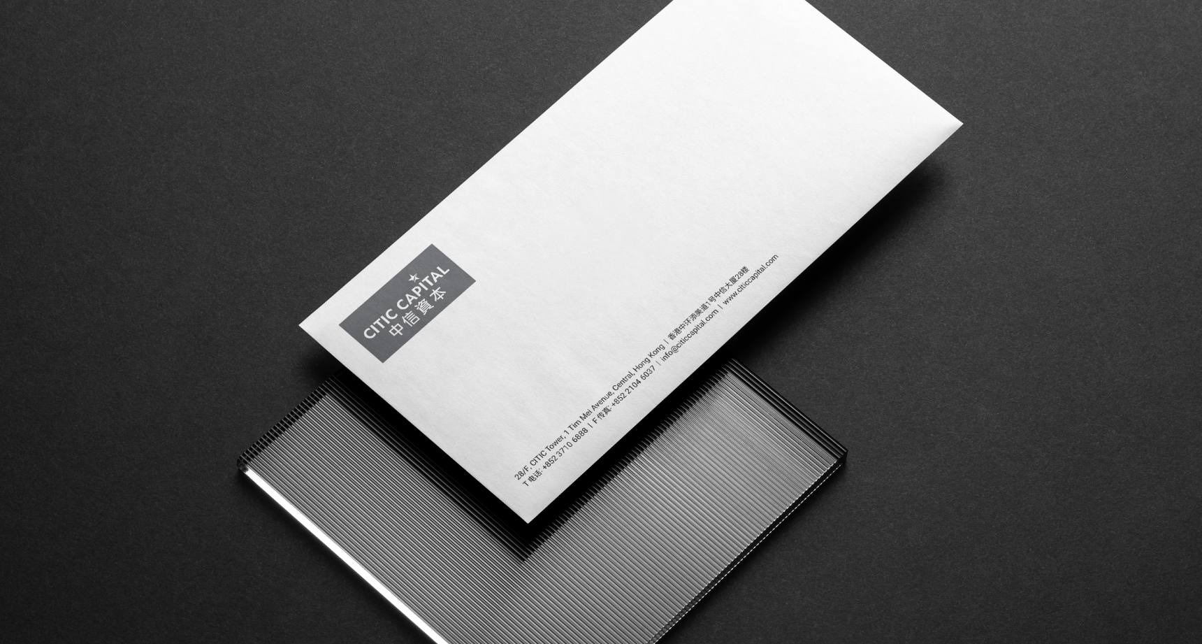
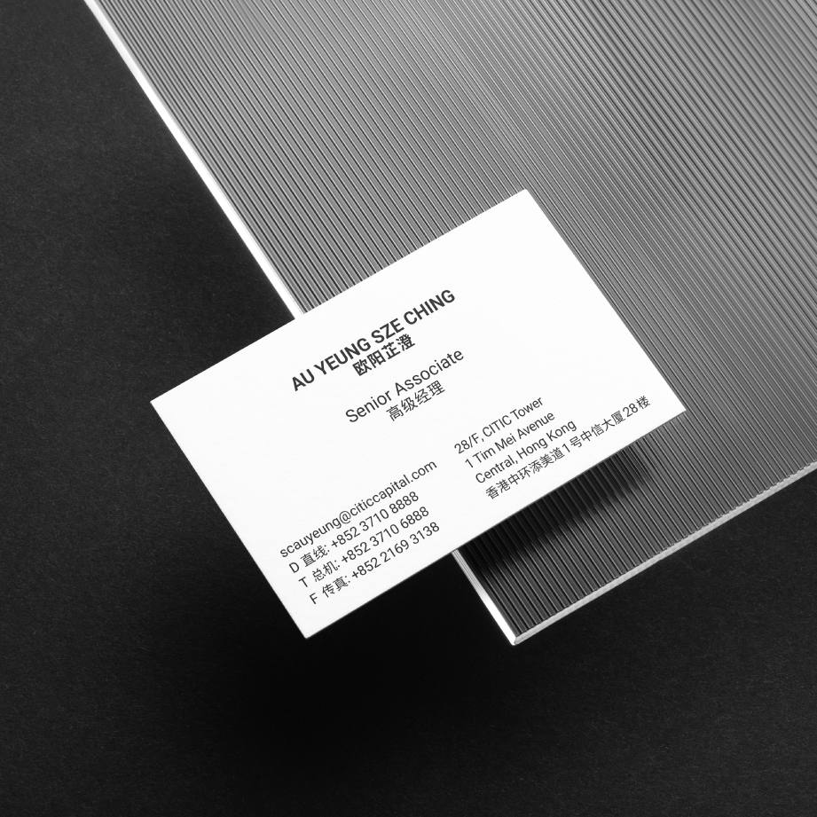
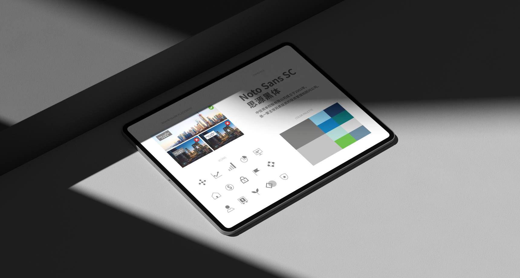
The palette of grey colours reflects the solid, calm nature of their investments. The contrast between the greys and the whites symbolises their difference from other alternative investment firms and their ability to distil complexities into concise solutions.
