the thought and wisdom of man
Brand Strategy
Androsophy was born with the idea of using the knowledge and views of men to raise children without giving up fashion – supporting fathers growing with their children through products they want to pick up, use and show off. To crystallise this vision, we helped create a unifying and insight-rich concept around the idea of "the thought and wisdom of man," guiding a brand providing a range of products for fathers and their families.
The brand name is derived from "Andro-", the root word meaning male, and "sophy", the suffix meaning thought or wisdom.
Together, the meaning of Androsophy is clear – this is a brand that understands men's thoughts and needs and offers products that men want, because it caters to function and style.

Based on shaping happier families through empowered fathers, we created a sophisticated brand identity system that caters to the modern man's style and function and understands every father's needs.

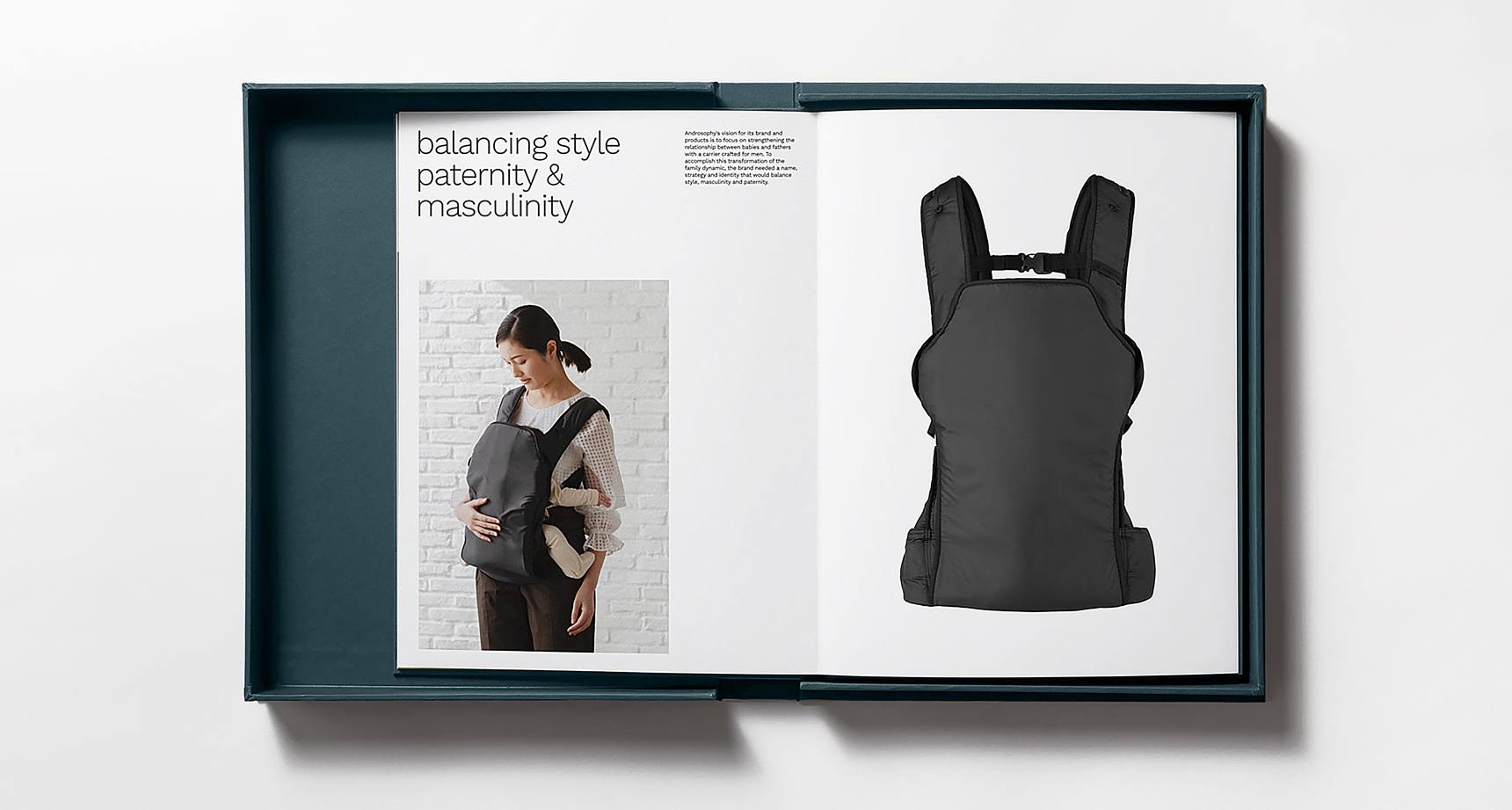
Combining human-centred design elements and a straightforward, uplifting voice that speaks to customers on their terms.
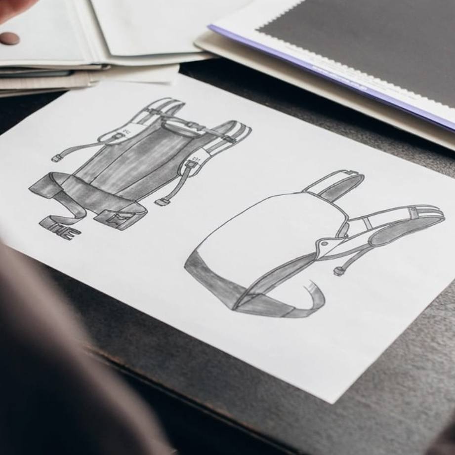
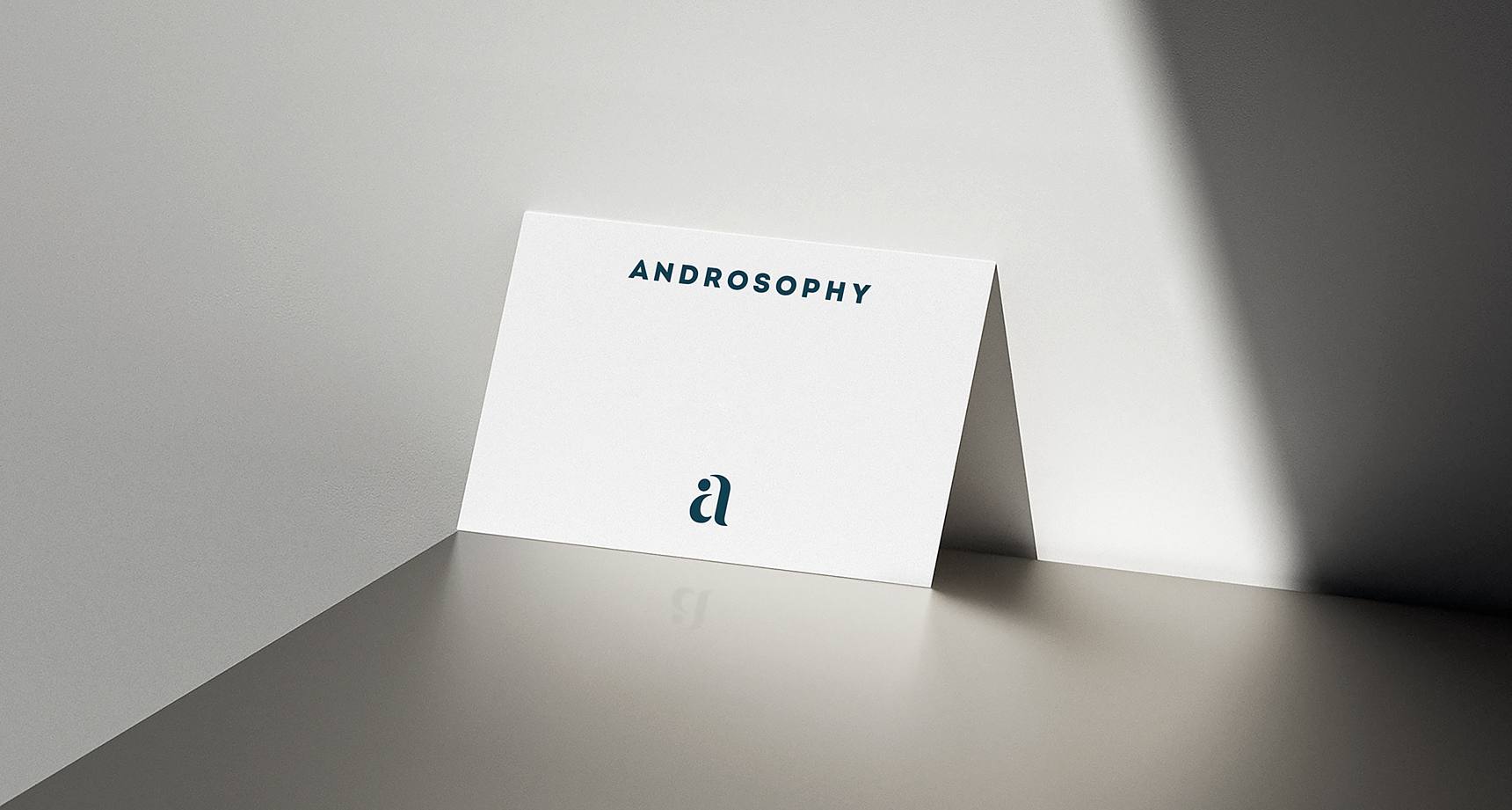
expressing the bond between father and child
The logo creation process centred on the core value of Androsophy: the strong bond between father and child, the result of child-rearing by an empowered man and family.
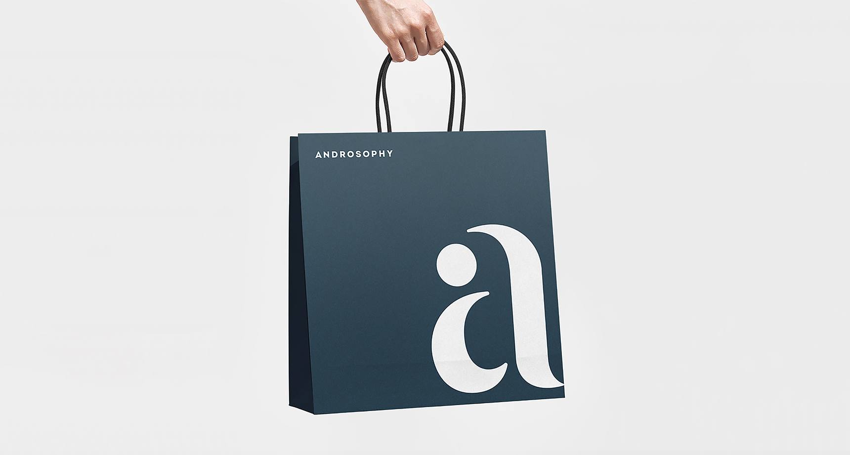
Soft curved shapes are configured to replicate a lowercase "a" and imitate the form of a baby in a carrier held protectively by a father. A bold, sans-serif wordmark creates a powerful and contemporary impression, creating a modern logo suited for a child brand and representative of the brand strategy and naming.
Bringing the value proposition to life, we designed an identity that balances the softness expected from a brand for children and families, with the unique sophistication delivered to "cool" fathers. From the typography to the colour scheme, we balanced this dichotomy with strategic and aesthetic clarity.
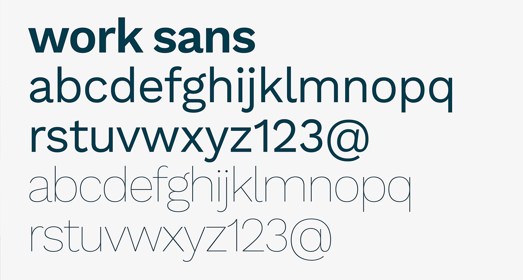
The typography needed to work hard across all applications, and was selected with approachability and digital applications in mind.


We wove the same compelling story through visuals and content across various touchpoints, activating a unified front and solid foundation for brand building.
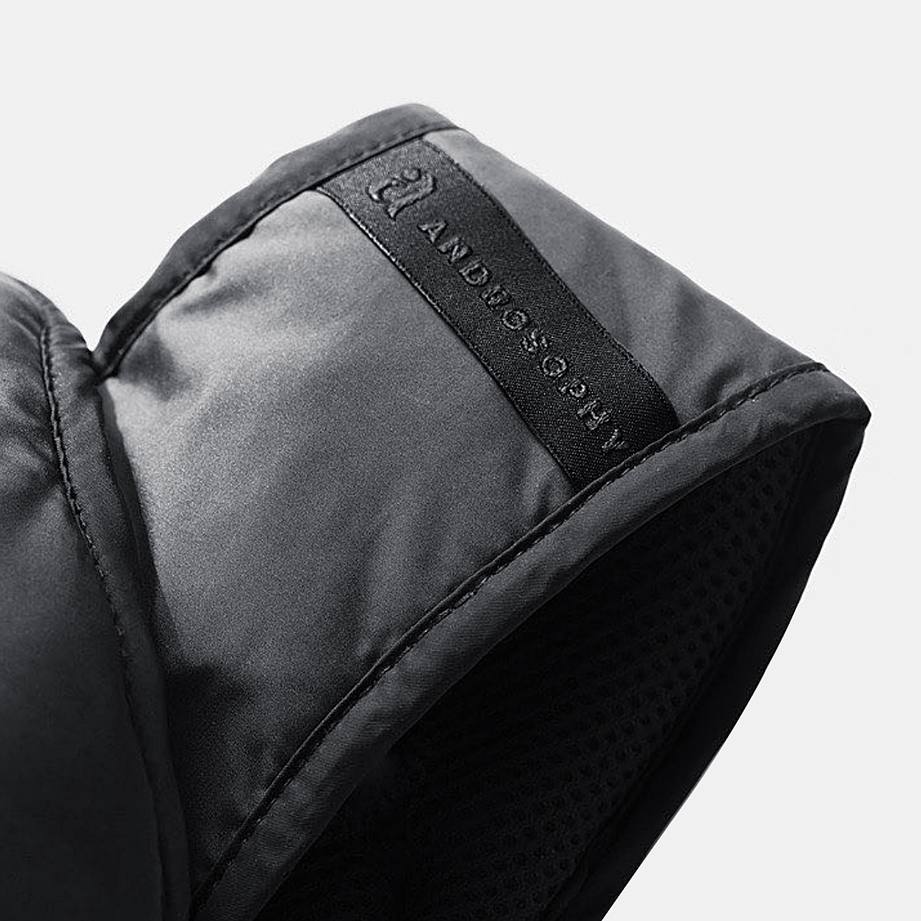
Expressing the proposition "the thought and wisdom of man" included creating marketing materials, packaging design and brand guidelines that convey the simplicity and clarity across language barriers.
Thanks
Super grateful to Asaki for giving us the opportunity to work on this project.
