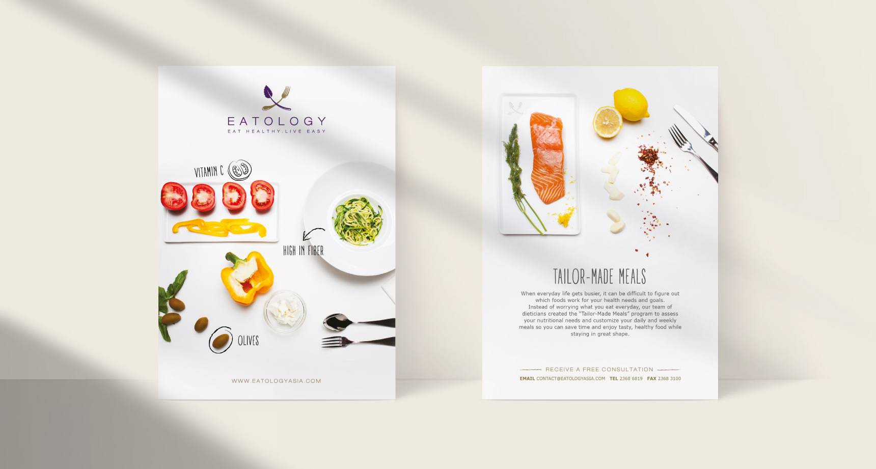
The brand identity captures Eatology's commitment to inspiring and empowering its customers to make healthier eating choices.
Eatology’s all-encompassing identity encourages cohesion and recognition between service and brand. “Ology,” meaning the study of, implies the scientific backing of the Eatology service and is supported by the logo, which combines the intersection of fork and plant to convey nutritious eating. The use of purple affords a refinement and association to many nutritious foods of the same colour.

eat healthy
live easy
We crafted a forward-thinking brand promise – positioning Eatology as innovators in a sustainably-focused and health-conscious industry.
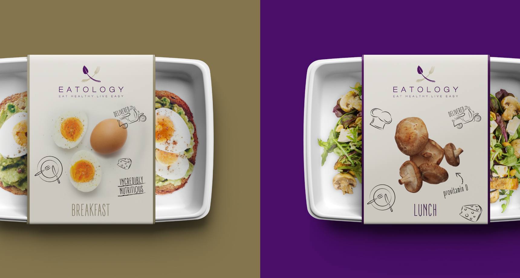
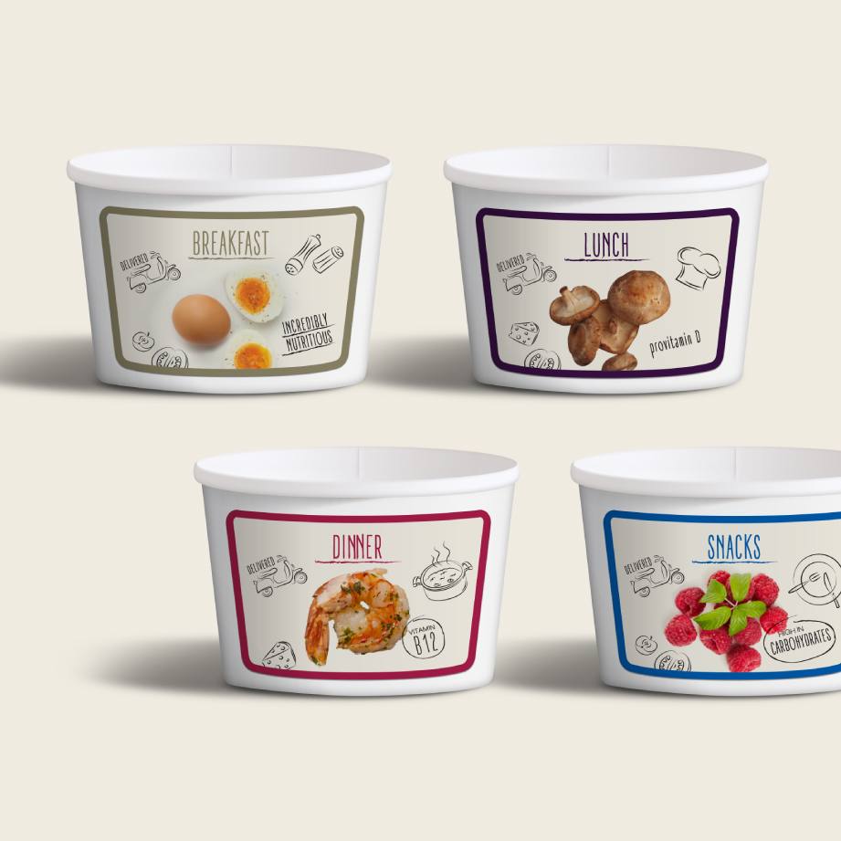
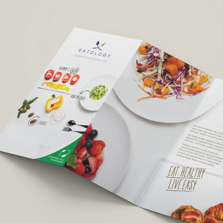
Environmentally friendly, compostable packaging was introduced to advocate for sustainability. We created packaging that focused on the already nutritious and vitamin-packed ingredients.
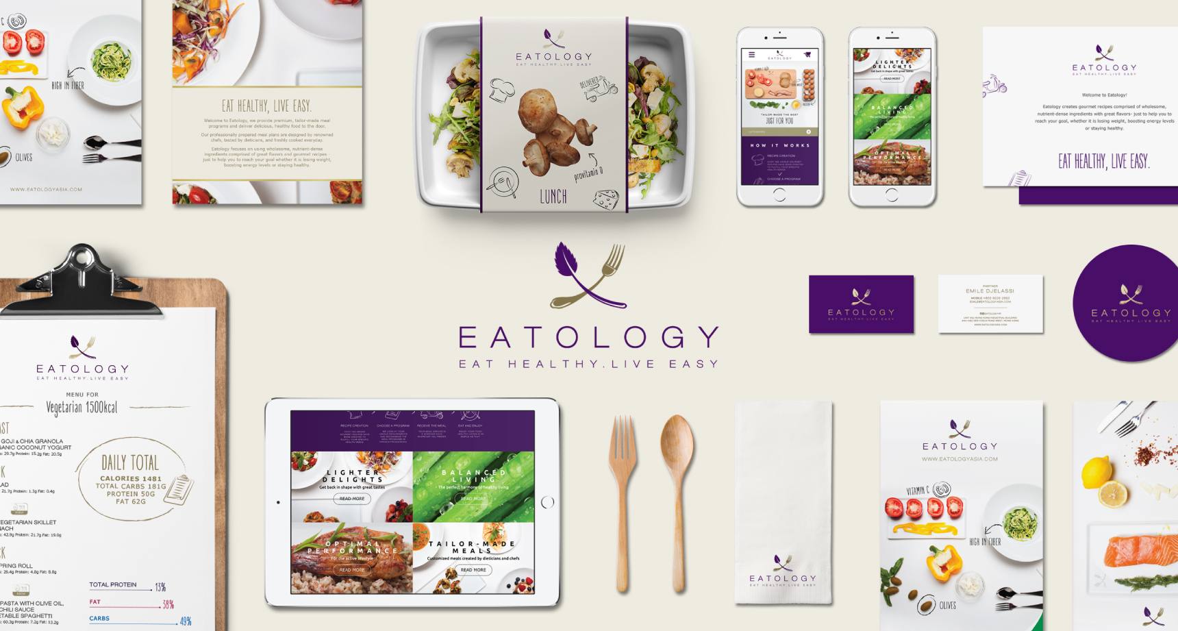
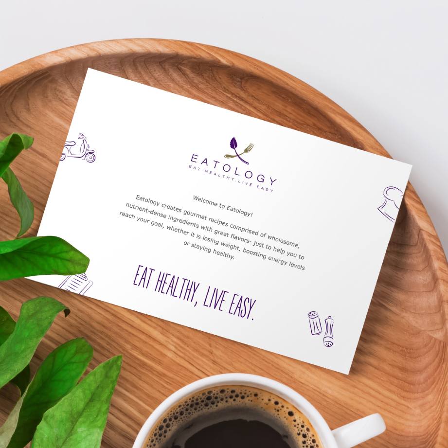
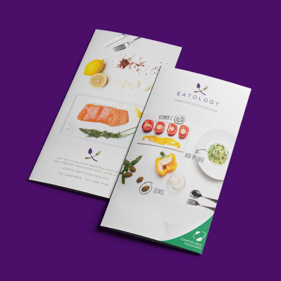
We provided Eatology with cohesive brand activation materials based on the new brand identity, including brochures, stationery, and in-meal instructions – all meant to simplify the dieting and eating process.
The design system is the foundation of the Eatology experience, unifying the audience through visuals and voice.
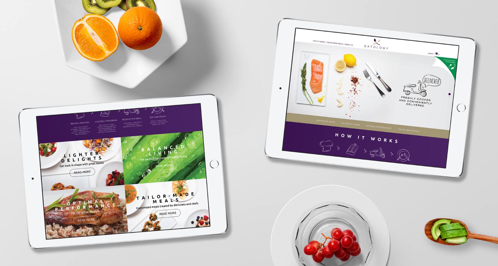
The mobile-first site streamlines the meal plan sign-up process.
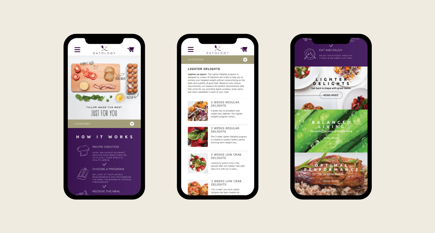
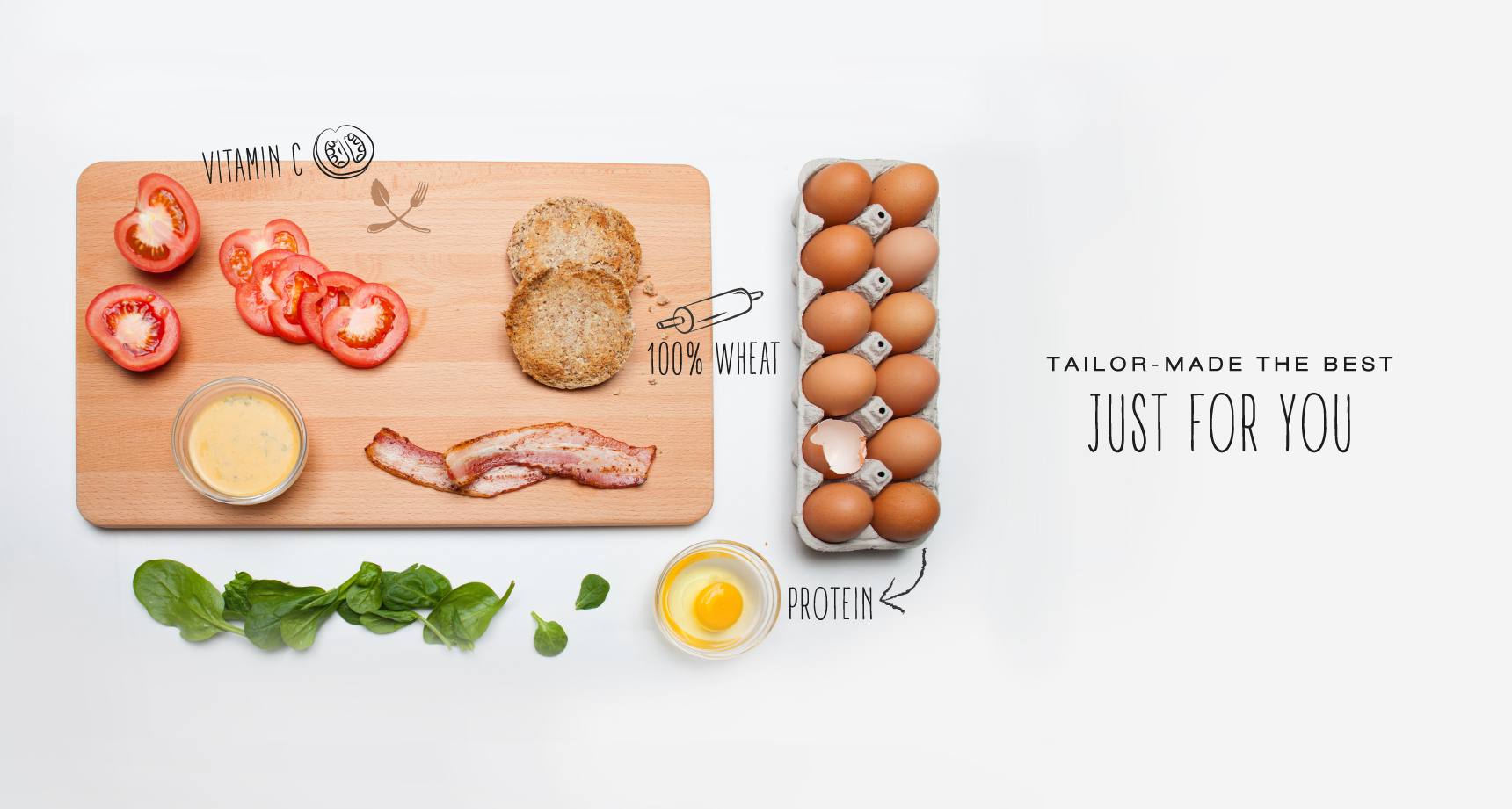
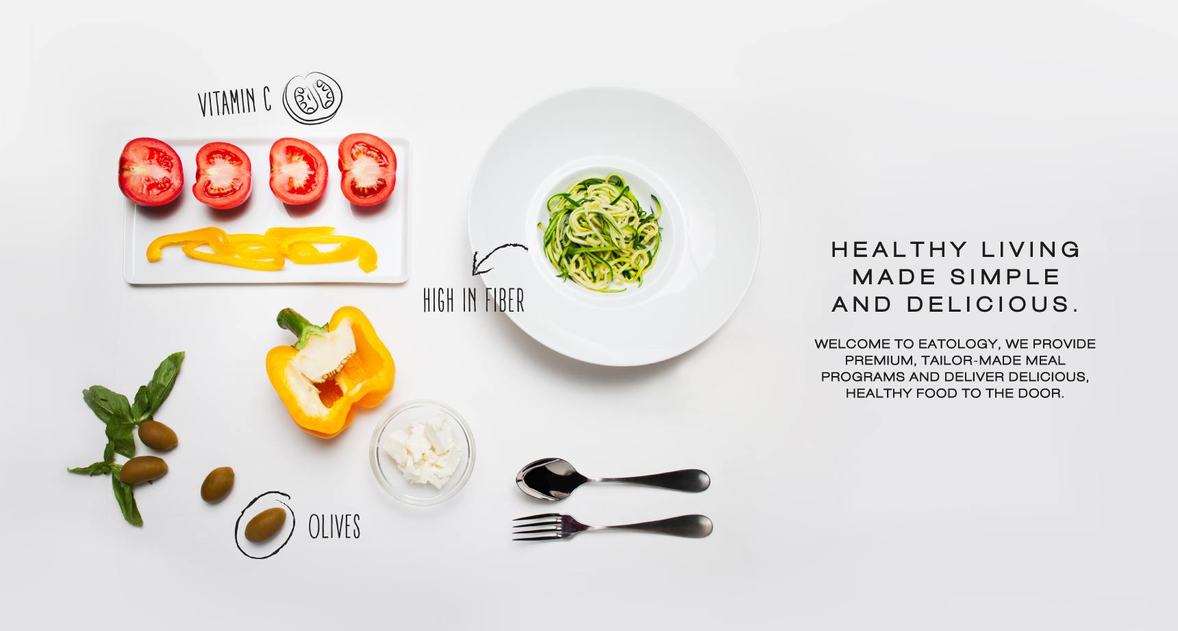
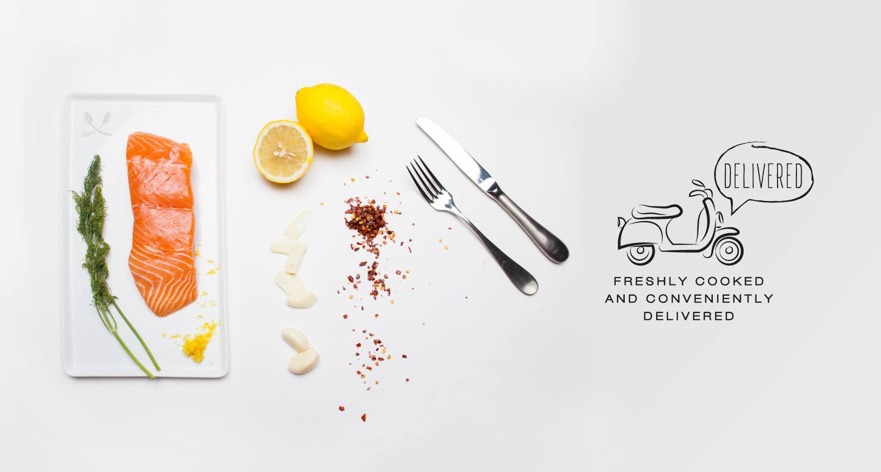
The photographic style aims to communicate the wide variety of fresh ingredients used in the meals – deepening Eatology's connection with its customers.
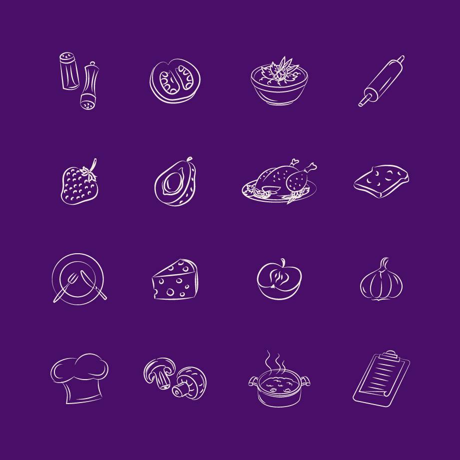
The familiar curves of the brand identity inspired the creation of a set of icons that are optimized for digital display.
