200+ pages
5 languages
7 personas
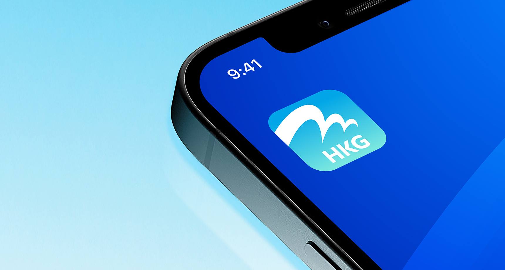
The name "My HKG" was chosen because it embodies the whole airport, includes the airport code, HKG, and contains the personal element with the word "My".
Naming
According to research, the original name of the app, HKG My Flight, did not resonate with stakeholders because it did not cover the extent of the app’s services. When executing our naming process, we considered a name that would embody the whole airport experience, retain a personal touch, and contain terminology related to the airport for easy identification in the App Store and Google Play. Based on these criteria, the name "My HKG" was chosen because it embodies the whole airport, includes the airport code, HKG, and contains the personal element with the word "My".
Brand Identity
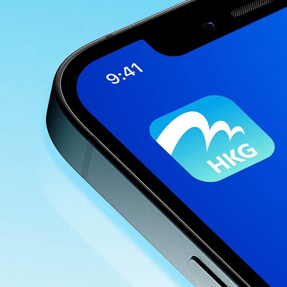
When translating the brand personality to brand identity, we ensured our revisions were intentional and not merely for the sake of alteration. With this mindset, we maintained the app icon’s association with the iconic HKIA logo but refined the typography to be friendlier.
Real-time flight updates
Boarding alerts
Baggage arrivals
Signage translation
Locations guide
Car park booking
Food ordering
High functionality
The challenge for My HKG was not necessarily competition with other mobile apps, but rather the competition for the attention, time, and memory space of travellers coming to HKIA.
Research and Insights
While an extension of the HKIA brand, My HKG serves a more specific mission and operates at a more personal level. Therefore, through a Comparative Analysis of leading travel industry brands and their companion apps, high-level input through workshops with Hong Kong Airport Authority Executives and user expectation insights from Social Listening, we developed a brand strategy for all other developments in this project.
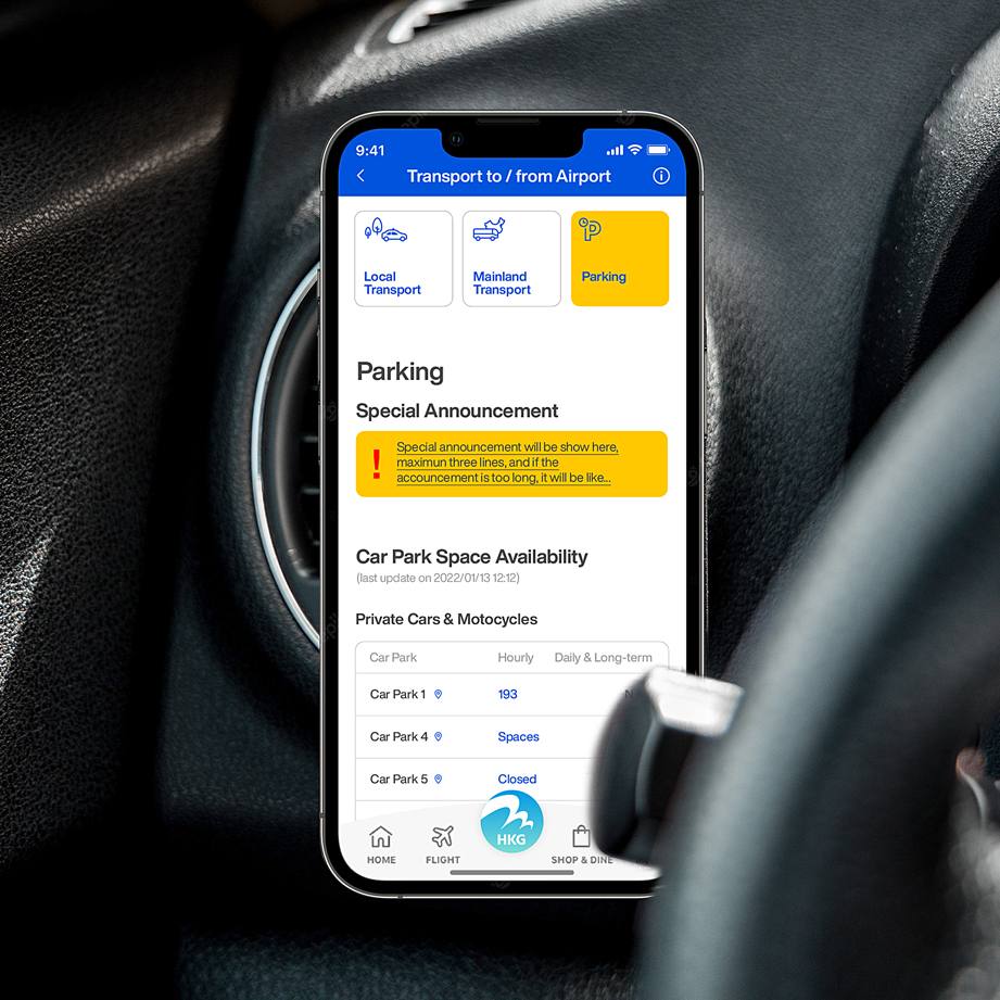
We created a personalisation plan that would filter content based on time before and after the user's tracked flight.
For example, functions 24+ hours before boarding would include transportation ticket boarding and packing checklists, while 3+ hours before boarding would filter car park booking services and wayfinding to check-in counters.
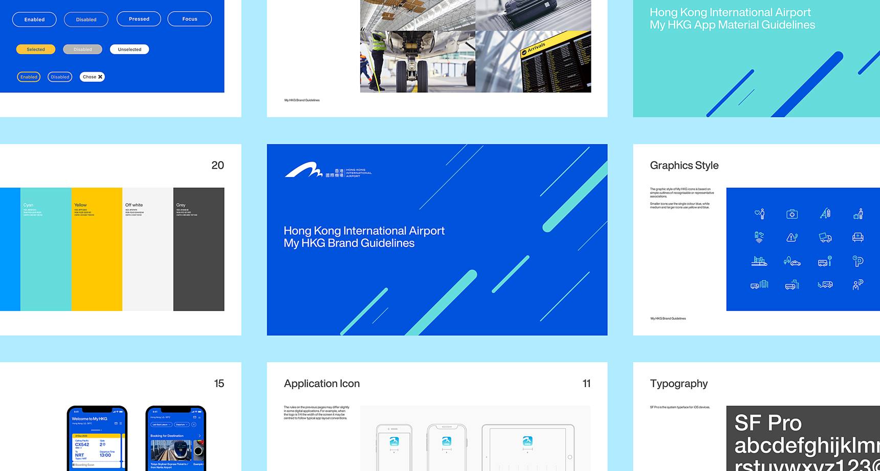
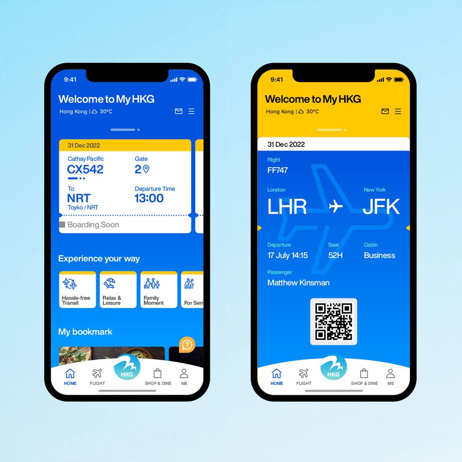
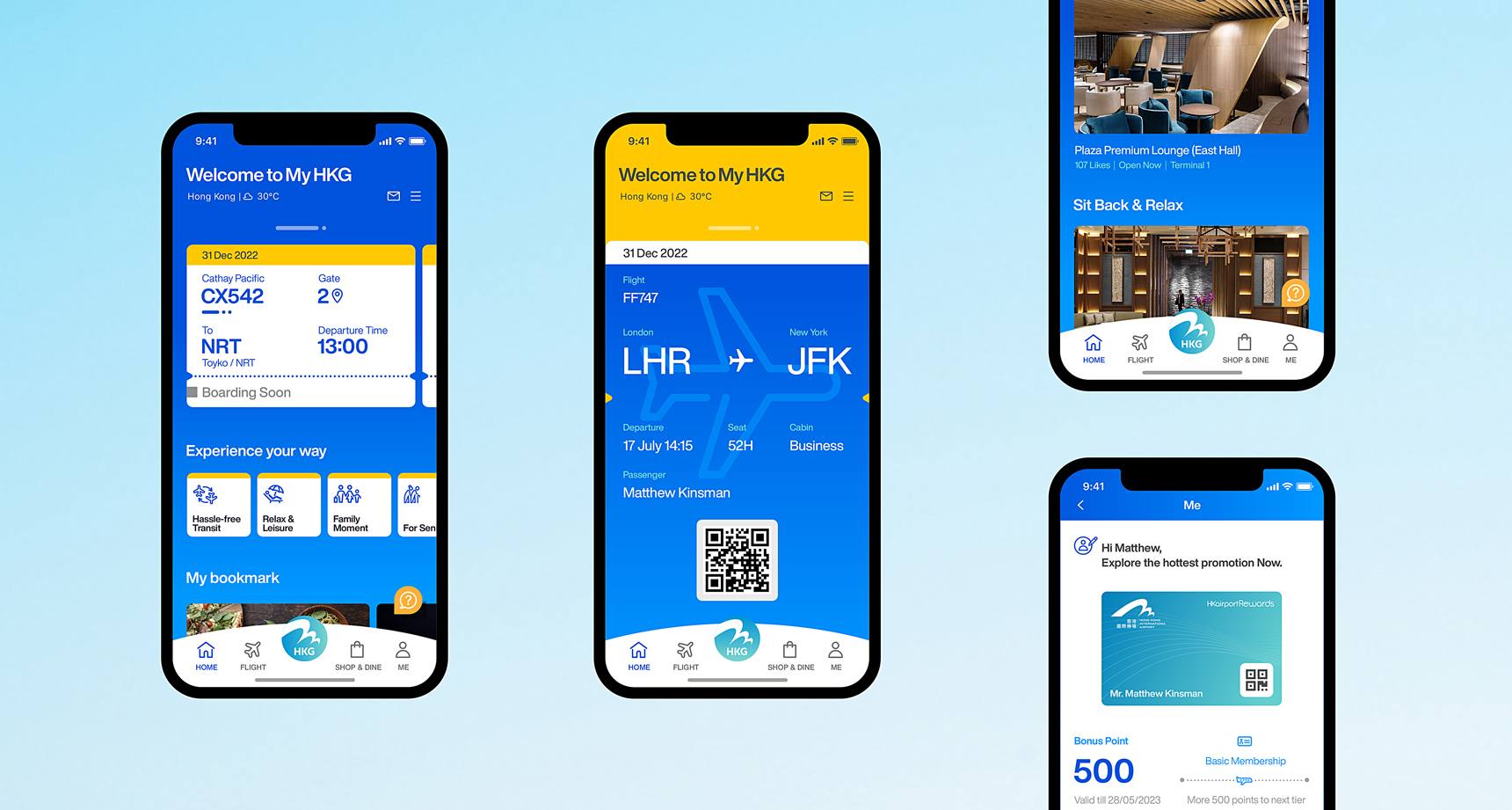
The colour scheme was updated for more contrast with a dark blue background and accents of vibrant yellow and the airport's wisdom blue.
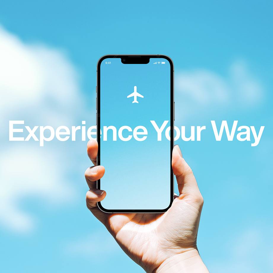
A new brand promise: Experience Your Way
Brand Strategy
We created a strategy that promises all travellers coming to, going from and exploring within HKIA the ability to "Experience Your Way", encouraging users to discover the airport in a personally unique way while also being aware, reminded of and directed to the next point in their journey. Therefore, we determined that the app should be a one-stop mobile platform that provides exclusive, up-to-date and trustworthy information, service and entertainment.
An approachable brand voice
Understanding from social listening that travel can be overwhelming for some travellers and boring for others, we wanted to emphasise the app's ability to think ahead of travellers' needs and enhance their experiences through personalised journey planning assistance. We refreshed the brand personality and tone of voice to be approachable and friendly to represent the brand's personal, cosmopolitan and intuitive values.
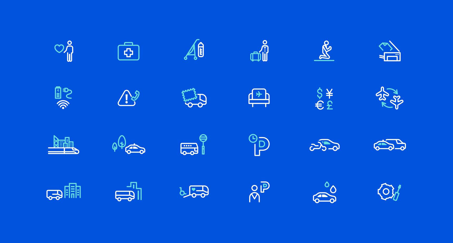
200+ Icons
A system of unique digitally-friendly iconography was created to communicate visually across language barriers.
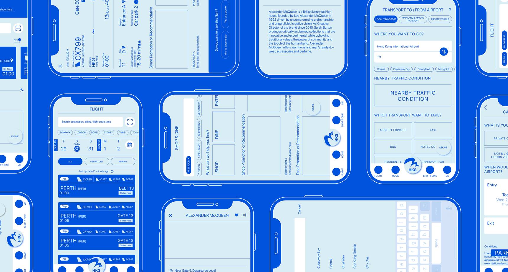
Analysing comprehensive user research, we identified pain points, categorized user personas and streamlined information and feature hierarchies to inform the app's UI and UX design.
User Interface
Through meticulous spacing, clear and familiar buttons, uncluttered layouts and updated typography, our experienced UI designers developed an interface that was not only user-friendly but also would reduce the hassle of a trip.
Our goal was to make sure the most needed information for each user persona was available on the home page or within one touch to serve users best.
